


My Bitchin' Portfolio
I just finished my portfolio for my creative non-fiction class. Well, not really finished - I still have the folder to acquire and stylize, but the content is done, and prettified.
Usually when I have to put together a portfolio for a class, I am dull in the extreme. I print out all my work in Times New Roman 12 with one inch margins, staple things together, and put them in any folder I can scrounge up in my house, and am done with it in short order.
This time, for what reason I'm not sure, I've gone a little further. Maybe it's because I'm drowning in MFA applications, and the last thing I want to do is look at something in Times New Roman, or make it look like a business plan.
I didn't go crazy with it, because I know that if I was a teacher, I would appreciate a certain amount of creativity, but only if combined with readability. In my view, a portfolio should not be a challenge to the professor that has a towering stack of them on his desk. That's just asking for it (and not very thoughtful, besides). But I am planning a trip to Ben Franklin today, to their astoundingly huge paper selection, to garner inspiration for a cool-type envelope, file, what-have-you.
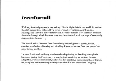
My favorite thing about the portfolio? The font. I likes it. I've scanned the first page, my artist statement, so that you can all share in the joys of Bodoni MT Bold with me. How is it I never saw this font before?
Usually when I have to put together a portfolio for a class, I am dull in the extreme. I print out all my work in Times New Roman 12 with one inch margins, staple things together, and put them in any folder I can scrounge up in my house, and am done with it in short order.

This time, for what reason I'm not sure, I've gone a little further. Maybe it's because I'm drowning in MFA applications, and the last thing I want to do is look at something in Times New Roman, or make it look like a business plan.
I didn't go crazy with it, because I know that if I was a teacher, I would appreciate a certain amount of creativity, but only if combined with readability. In my view, a portfolio should not be a challenge to the professor that has a towering stack of them on his desk. That's just asking for it (and not very thoughtful, besides). But I am planning a trip to Ben Franklin today, to their astoundingly huge paper selection, to garner inspiration for a cool-type envelope, file, what-have-you.
My favorite thing about the portfolio? The font. I likes it. I've scanned the first page, my artist statement, so that you can all share in the joys of Bodoni MT Bold with me. How is it I never saw this font before?
posted by erin | 9:28 AM
![]()
![]()
1 Comments:
i love what you wrote (i clicked on it so i could read it). and i agree, the font is awesome. it looks like a published book page...maybe that's what makes it so appealing. ;)
Post a Comment
<< Home